
Recently, while I was scrolling through r/dataisbeautiful (highly recommend), I saw a pie chart of different Pokemon types. That made me ask the question - what other information can be derived from Pokemon? This project will answer that question with many visualizations and statistics - I hope that you enjoy!
Pokemon is a large media franchise based in Japan which revolves around humans living with fictional creatures known as Pokemon - monsters based on plants, animals, mythology, and anything in between.
The first Pokemon game was released in 1996, and to this day, many games, books, comics, movies, TV shows, cards, and much more have been released under the label, resulting in it being the highest-grossing media franchise of all time.
Although I was not a huge Pokemon card fan, I loved watching the TV shows and movies, and sometimes would meet up with friends and play with them. Due to this being a great childhood pastime for me, the minute that I saw a great dataset available, I knew that I had to use the data.
I started my search on r/datasets, a subreddit devoted to sharing datasets acrsos the internet. A search for pokemon related datasets yieled in this dataset from Kaggle which included an extremely thorough set of information about every pokemon. I downloaded the dataset as a CSV, and started my parsing.
For this project, due to the dataset being extremely clean (rated 10.0 on a 0-10 scale on Kaggle), it was extremely easy to parse the data. After using readlines and splitting it by commas, I constructed multiple arrays and dictionaries with the desired values - name, height (m), weight (kg), Generation, Number of Types (1 or 2), First Type, and Second Type (blank if doesn't exist).
After reading all of the files and constructing the arrays and dictionaries full of values, I decided to put them all together in a DataFrame object, as that would create the cleanest data. I imported the pandas library, and then created a new DataFrame, and finally added all of the lists and dictionaries that I previously creaated to create an extremely comprehensive DataFrame object, which I then downloaded as a CSV file.
This was the most time exhaustive part of my project, because I believed that with the data that I created, I could have made many different charts. I first uploaded the CSV file to a Google Sheet, where then I could make adjustments to it. I made a variety of diagrams through the built in charts feature. However, in my data, I realized that many of the charts had outliers which had to be taken out, and some charts had to be adjusted to make them easier to read. I have put footnotes under every chart that was adjusted with a description of how it was adjusted.
This section is all of my visualizations - there are 7 charts, comprising of bar charts, pie charts, scatter plots, and histograms. At the top of every chart, I explain what the chart is showing, and below, I explain any relevant information about my manipulations of the graph, and a short description of some patterns seen in the graph.
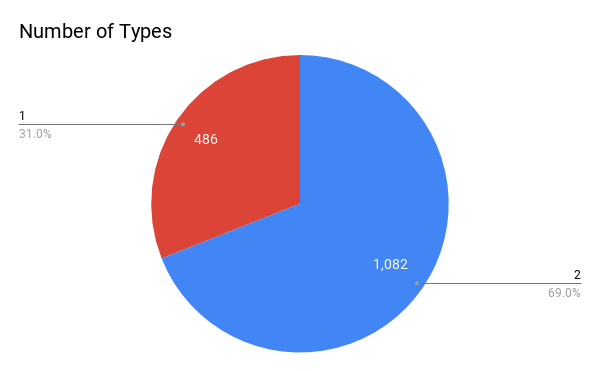
This graph is a pie chart describing the percentage of those who have one type (i.e. Fire, Water) and those who have multiple types (i.e. Grass/Poison, Psychic/Fairy).
This graph is a scatter plot displaying the height vs. weight of each Pokemon. For this graph, height is on the x-axis, while weight is on the y-axis.
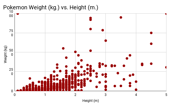
For this graph, the height was in the range [0, 5], due to the fact that the majority of heights fell in that range.
To do some more statistical analysis, I looked at the line of best fit through Desmos. This equation (in the form y = mx + b) was y = 62.9694x - 22.4592. The R^2 value for this was 0.4238, meaning that a linear model was probably not the best model that we could have used, but when testing other types of models (quadratic, cubic, exponential), the R^2 value decreased, showing that the fit of the model actually got worse. In reality, due to there being large amounts of clustering and repetition in the data, it is unlikely that there is a model that would have fit the data well.
The next model that I created is a histogram depicting the weight (kg) of Pokemon.
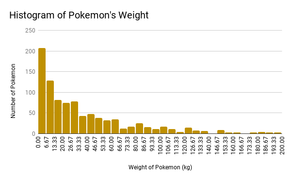
For this model, we can see that it has an extremely positive skew, due to the majority of Pokemon having low weights. For the data, I have cut out 90 Pokemon with weights ranging from 200 - 1000 kg, because I found them all to be outliers with large variations which only further skewed the data.
One potential solution was doing unequal binning, but for the time being, I wanted to keep the data with it's actual values, instead of assigining artificial boundaries.
My fourth chart is a histogram of height values in meters of Pokemon.
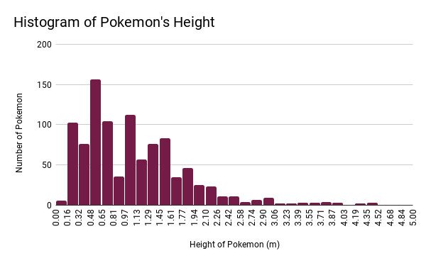
For this chart, I set the bounds to [0, 5], in order to remove the outliers. Through this manipulation, 21 Pokemon were removed.
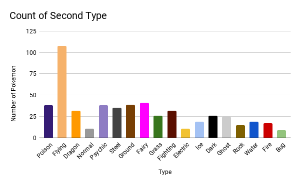
This chart is a bar chart of Pokemon's second type which is color coded to represent the type.
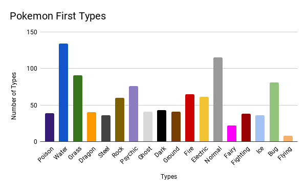
This chart is a bar chart of Pokemon's first type which, similar to the above chart, is color coded.
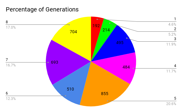
This last chart is a pie chart which show what percentage and number of Pokemon come from each generation.
Some interesting trivia from the data:
On the whole, this project helped me develop my data visualization skills, along with heling familiarize myself with the pandas library.
If I could change anything about this project, I would do one of two things: